
Than simple sites are better than others?
Moreover the «typical» sites with readable design were assessed as the most attractive in all respects.the study of Google employees in August 2012, the researchers found not only that the user attract sites, download a 0,02–0.05 seconds, but that "easy to read" sites accordingly seen as less attractive than their more simple copies.
Moreover "typical" sites - those that contain components, generally associated with the sites of the level of the perceived design were assessed as the most attractive in all respects.
In other words, when studying it turned out that the simpler the design, the better.
why?
In this article, we'll see why something like cognitive fluency and theory of visual processing of information can play a crucial role in facilitating your web project and as more simple design could lead to large cases.
We will also look at a few random research sites in which simplify design, and how it has improved the frequency of references to them, give you some hints how to simplify your own design.
What is a "typical" website?
If I said "furniture», which image surfaced would in your head? If you belong to the 95% of people do you think about the chair. If I ask what color symbolizes "boy" you think you "blue", girl = pink, car = sedan, bird = Malinovka etc.
"Typical" is a fundamental mental reflection, which creates your brain to classify all with which you interact. From furniture to web sites, your brain has created a template of how to see and perceive the objects.
"Typical" the site is broken down into smaller categories. You have different, but a mental image for social networks, places to e-Commerce and blogs – and if any of those special websites misses something of your mental image of you reject it on the conscious and subconscious levels.
If I said "Interactive online store clothes for fashion 20 – "no matter what"», then you could suggest something like this:

this implies that "interactive clothing store" is imprinted in the minds of so close, that reflects the many signs of a similar design online clothing store for hip-hop.
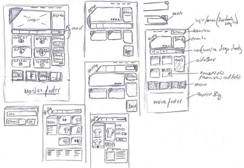
none is not lacking in originality, and it is unlikely that they "steal" each other. Instead, they play your original expectations of what should be a commercial site.
What do you mean by cognitive rapidity?
the Basic idea behind cognitive fluency is that the brain prefer to think about the things about which it is easy to think. That's why you prefer to visit the sites on which you instinctively know where everything is, and know what actions you're supposed to do.
«Fluency leads our thinking in such a condition, in which we have no idea what it works and affects us in any situation in which we weigh information." site Uxmatters.
Cognitive fluency – this is the basis of regular behavior, known as a Simple effect, which essentially sets out that the more times you are exposed to the stimulus, the more you prefer.

again, these rules apply equally to online.
It "familiar" for blogs contain opt-in (s) on the right-side panel or for commercial sites to post a high-resolution image with breathtaking attention to the title and logo of the company at the top of the left side of the screen.
If your visitors generated by certain features which are standard for a separate category of customers, deviating from this, they could subconsciously put you in the less attractive" category.
Here presents "handful» commercial sites. Look, would you notice any similarities.


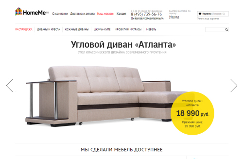
Note: whatever you do, for the sake of the love of God, do not take what I am teaching as "do what everyone". Therefore, if you are not attentive, you could hurt yourself.
It is important to understand that the elections design - "prototypical" for the site in your category, but it is more important to find evidence which confirms the correctness of elections design result in some ways the rise.
Some of the key changes that lead to tremendous results:
- Place the theme by analogy with commercial sites
- "Open" much more free space
- Stop feature a separate product high-resolution images and the use of contrasting colors.
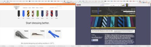
Here are options for site redesign impressive, both for two and a half weeks after the start of operation:

Redesign itself is still largely is nothing special. It operates exactly expectations of what should be modern, retail online seller of clothing. This “the” responsive, and has a consistent design language for all pages of products.
But compared to the old site, it is obvious that the lack of these simple elements had an adverse effect on the willingness of buyers to make purchases on this site.
How visual information processing should affect the complexity of the site
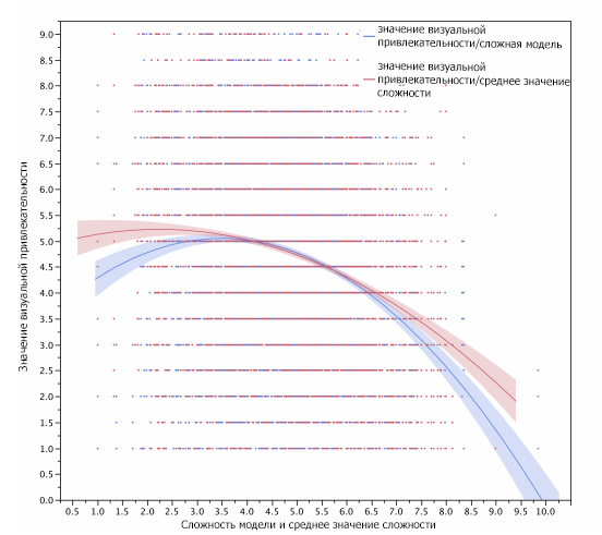
In joint research of Harvard, the universities of Maryland and Colorado, researchers found a strong mathematical relationship between the “a pleasant aesthetic” for various categories of the population - for example, participants related to professional diagnostics of the equipment did not like saturated colors websites – but there was no recommendation for creation of the universal appeal.
The only thing that was universal, because it is something more than difficult to understand web site, the lower its visual appeal.
Why simplicity from a scientific point of view, it is easier to handle
the Reason that less "visually complex" sites are considered to be more attractive is partially sites not high complexity not require the same hard physical labor from the eyes and brain to decipher, storage and processing of information.
Essentially, your retina converts the visual information from the real world into electrical impulses. Then these pulses pass through the appropriate photoreceptors to convey the color and light information to the brain.
The more light and color variations on the page (visual complexity), the more work the eye necessary to send information to the brain.
“… eye receives visual information and converts it into neural activity, which returns to the brain, where it is stored and “encoded». This information can be used by other parts of the brain connected with mental activity, such as perception and attention.” – now Simplypsychology.
Each element conveys the subtle information

this is why it is important, making a web site to remember every detail – design, logo and color choice – convey subtle information about the brand.
When these elements do not perform their work, webmaster often compensates for this by adding unnecessary copies and/or images, thus, adding the visual complexity of a web site and taking the overall aesthetics.
Optimization of pages is to provide information in a visual form – especially simplifies information "travel" from the eye to the brain ’ this is something like the maximum transmission from what you can, in so few elements as possible.
When they decided to make a brand to grow, they have not added a normal “We do emails 2001, 3 million people trust us, that's why we are nice, blah blah blah”.

Instead, they reduced the amount written, simplified website – main title just to read “Send best letter” – and added even more simple animation of a basic product ideas (a product of the position of the main benefits for which the customer buys the goods).
Before:
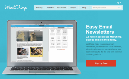
:
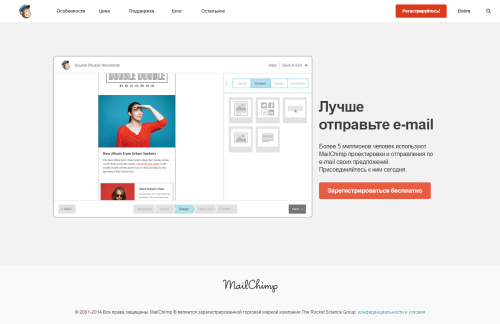
Even though it was part of a larger development strategy, the results are impressive, more than a million new users it was added when a new brand for the first time debuted.

”Short-term memory” and the Holy Grail conversion
All this simplicity leads to the fact that information in a visual form immediately finds its way to the brain.
According to a famous research psychologist George A. Miller in Princeton, the average adult brain can store between 5 and 9 “portions” information within a short period of time in short-term memory.
Short-term memory is part of your brain which temporarily for a few seconds, stores and processes information. It is something that gives you the opportunity to focus, to resist the fact that it is distracting, and most importantly, allows you to make a decision.

All about what we have discussed up to this point is to reduce the amount of the noise", which falls in short-term memory.
So simple site and gives 5-9 “servings”that short-term memory tries to handle this kind of guarantees, product descriptions, prices or quotations. When short-term memory can focus on solving the problem, it will try to resolve it as quickly as possible.
Deviation leads to shedding
if you deviate from the expectations of the person ’ s the price was higher than expected, color scheme and proportionality were absent, the site did not load fast enough, the pictures were not enough good quality – short-term memory handles these slow “servings” instead of that matters.
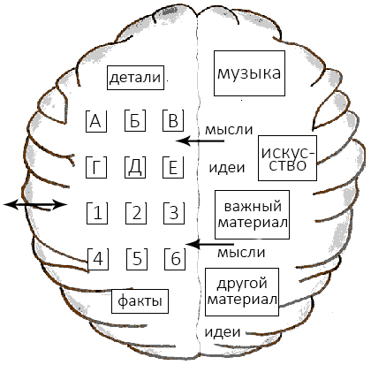
All because short-term memory refers to long-term memory to use what is already known for the job. When long-term memory cannot help in information processing, the process is aborted and the temporary memory is released and moves on.
That is why it is so important that you understand the level of security of your visitors from influence on them – not only for sites of your level, but for websites – if you want to “cut” design in their short-term memory.
Blogs they read, sites where they shop, their browser, age, gender and the actual location makes it clear, how it will affect their degree of familiarity on the first impression.
Conclusion
If visitors can't rely on its previous experience, they do not think about how innovative you now. They just leave, wondering why objects are not located where they should be. Not in the best mood, if you want to buy things.
st. Akhmatova 9/18
st. Chornovola 2-A
Sat. 11-00 -16: 00